Responsive web design
I have been looking at responsive web design recently due to the undoubted use of smart phones and tablet devices that are now used to view websites on.
From my research and testing it seems a responsive design broadly uses 3 special features:
- 1. A flexible framework that can be a fluid grid type system or an adaptive system. There are many examples available eg Twitter Bootstrap, Skeleton etc etc
- 2. CSS3 Media Queries (see link http://www.w3.org CSS3 Media Queries)
- 3. Fluid flexible images (see link A List Apart Fluid Images)
Responsive design term
Ethan Marcotte (website A List Apart A List Apart website responsive article) is attributed with coining the term “Responsive Web Design”.
My research and experience has shown me that responsive design is not so easy and straight forward but it is quite fun to try and meet the challenges of designing and creating websites that display well on small screens for phones to super wide desktop screens.
As en example of a responsive design see Simon Padbury’s GO Light responsive web page design at GO Light responsive
In response (pun?!) to the many fluid CSS grid frameworks I encountered when I started my research I decided to make my own! Why? When there are so many free available?
Well, my reasoning is for simplicity and understanding. I wanted a basic easy to use grid framework and some of the available ones are not simple or easy to use and understand.
Melody CSS Grid by @molovo (James Dinsdale) was one I liked for it’s apparent simplicity and ease of use (see Melody webpage http://melodycss.co/ ).
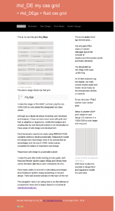
My own basic responsive CSS fluid grid rhd_DEgs
Well I have made my own fluid css grid heavily based on Melody CSS grid framework. Clicking the image below opens a 2 column layout using rhd_DEgs Fluid CSS Grid.
The files can be found on the rpd/rhd_DEgs GitHub repo rpd/rhd_DEgs GitHub repo
I hope to develop rhd_DEgs more myself in the future and if you want to use it then feel free!
Leave a Reply